
Filling holes in CSS Grid with grid auto flow dense
CSS Grid enables responsive elements with variable sized grid items all without media queries. You may have hit a problem though. After creating different sized grid items there are holes left in the layout where a grid item didn’t fit. The spec writers thought of this scenario and with grid-auto-flow, you utilise a packing algorithm to fill those holes with grid items as they’re found.
Here’s the CodePen example of the layout we are going to create. It’s a grid of card items with banner-like cards every seventh item.
The code for this layout can be boiled down to this:
ul {
    display: grid;
    grid-template-columns: repeat(auto-fit, minmax(250px, 1fr));
    grid-auto-flow: row dense;
}

li:nth-child(7n) {
    grid-column: 1 / -1;
}
Let’s take a look at the code for each technique.
RAM (Repeat, Auto, Minmax)
grid-template-columns: repeat(auto-fit, minmax(250px, 1fr));Una Kravets introduced me to the acronym RAM in her article Ten modern layouts in one line of CSS. RAM stands for Repeat, auto, minmax and the technique ensures items auto-fit to the grid and the value is no smaller than the minimum and no larger than the maximum value. It achieves responsive grid items without media queries. Awesome!
Spanning
grid-column: 1 / -1;`Spanning grid item uses a technique I covered in Superhero layout series layering panels, but recapping; CSS Grid lines are numbered 1 to n (n being the total number of lines) but also in reverse from -1 to -n. This allows us to set the grid columns to 1 / -1 which begins at the first grid line and ends on the last grid line, thus spanning the full width of the grid - even if the number of columns changes!
Combined with the nth-child selector we can target every 7 items in the grid:
li:nth-child(7n) {
    grid-column: 1 / -1;
}
Filling the gaps with grid-auto-flow
Now with responsive grid items and spanning banners we can see the hole issue which looks like this:

To resolve this we set the following on our grid:
grid-auto-flow: row dense;The dense attribute tells the packing algorithm to layout grid items in a way that when it finds an item that will fill in a gap, use that item to do so. We now have all the requirements of the layout.
Keep in mind...
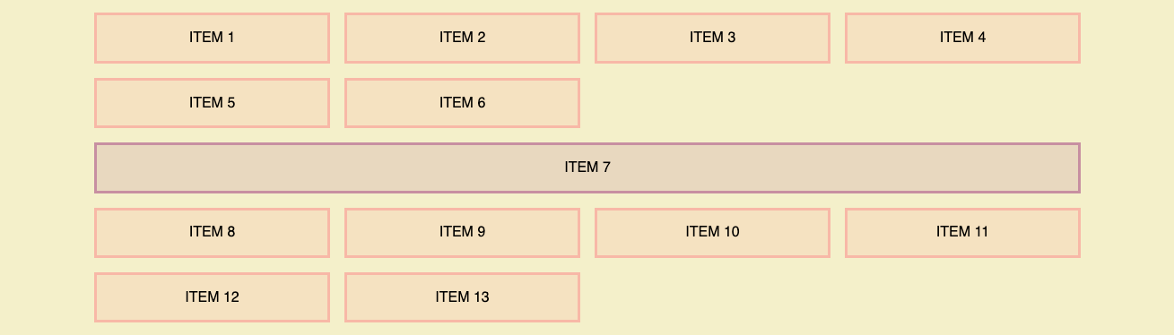
This approach moves the items from their defined source order. A possible accessibility issue. Depending on the layout this might not be an issue but worth considering if you take this approach. Take a look at the labels in this screenshot:

Notice items 8 and 9 are now before item 7, despite the source code order. If your content is reliant on the order then this technique might not be the best choice. A list of product cards though would be ok.
I hope this article has been useful in learning some tips and tricks with CSS Grid especially if you ever found yourself with gaps in your grid. Take a look at the demo on CodePen which allows you to toggle between dense and the regular row value of grid-auto-flow. I find interactive demos like this a great way to gain an understanding of concepts.