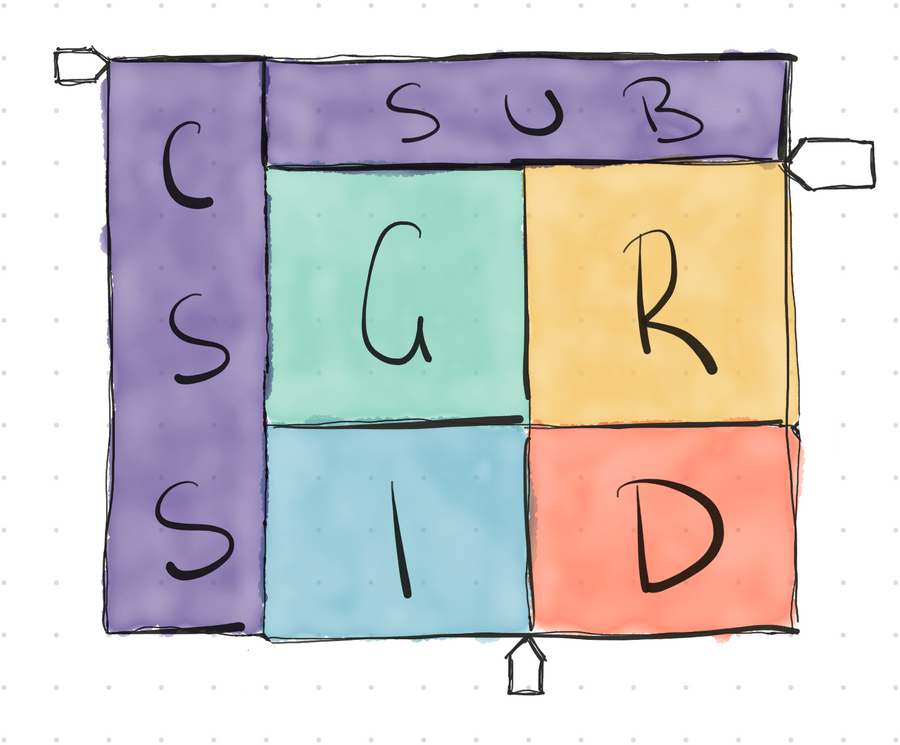
CSS Subgrid Illustrated Guide
If code examples are all you need, check out the Codepen.
If you have ever heard the saying “This is the best thing since sliced bread” and were wondering how that could be used when talking about layout on the web, it would be CSS Grid. Grid is the most powerful layout tool we have and it’s transforming how we approach web layout.
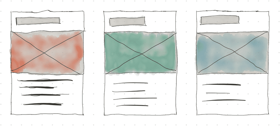
A common layout pattern is multiple cards along a row (Figure 1). Let’s say our cards feature a title, hero image and body text. Card designs often follow the happy path, which is to say, the title is an appropriate line length and the body text too.
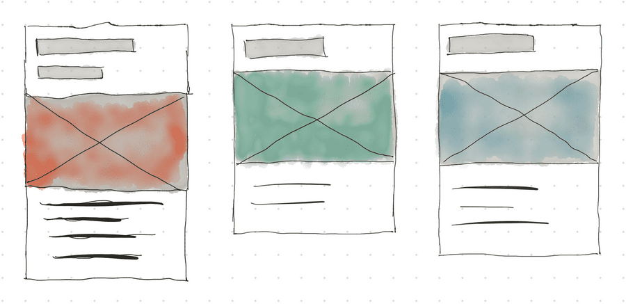
Often however, in production, things go a little differently. Title and body text length can vary wildly between cards. This can ruin the aesthetic of the nice even cards across the row.
There are ways around this, you can limit the content that’s allowed to be used, set a min-height or height on elements will keep alignment but these restrict content or can lead to the visual aesthetic being sacrificed.
You might be wondering whether Flexbox is a possible solution. It will get you most of the way there, but you might need to sacrifice design and/or semantics achieving the desired outcome. You could consider nesting grids but the problem is each individually nested grid does not know about the size of the other grids this means the tracks won’t align, much like in the case of Flexbox. So what can we do?
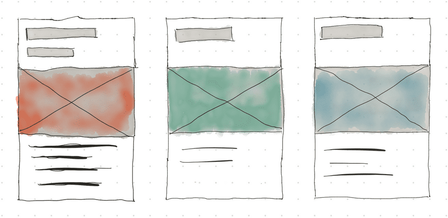
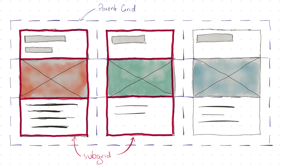
Enter CSS Subgrid. Subgrid gives nested grid containers the ability to inherit the size of the parent grid tracks. Without inheriting the parent’s grid track size items are independently size-the same behaviour as the Flexbox or nested grid examples mentioned earlier.
Note: A Grid Track is the space between two grid lines and can be either vertical or horizontal.
With the parent grid providing the sizes for the three tracks the nested Subgrid will inherit the size of the parent track and resize to the largest grid cell across the entire row. Thus lining up the items!
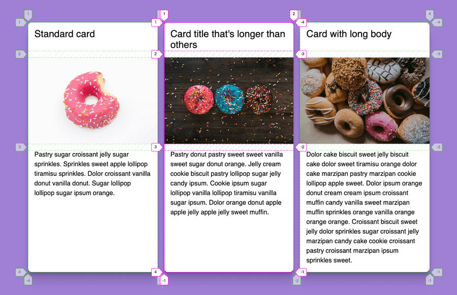
With nested grids it can be difficult to visualise just what’s happening but thankfully Firefox has a fantastic Grid Inspector that makes debugging and working with CSS Grid much easier! (see Figure 5) Using our example you can enable the Grid Inspector on each of the grid and see how the grid is interacting and sizing to the parent’s grid track.
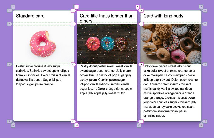
Firefox’s Grid Inspector demonstrates how Subgrid adds the gap between the rows. You can override this with Subgrid by setting the gap property, adjusting the gap size within the nested Subgrid.
So far Firefox 71 is the only browser that supports CSS Subgrid. Even though the browser support is looking slim right now, it won’t be long until the other browsers implement subgrid too. Keep an eye on caniuse: Subgrid to see when more browsers start supporting Subgrid.
If you’re interested in the code for the examples, then take a look at the CodePen.
Resources
- CSS Grid Level 2: Here Comes Subgrid by Rachel Andrew
- Grid By Example: CSS Subgrid by Rachel Andrew
- Subgrid by MDN
CSS Grid is so powerful that even without support for CSS Subgrid you'll be able to do great things. It's at a point where you can reliably use it in production and it's a great experience. While you might run into little gotchas like this it won't be long until there'll be a solution for those too!
