Getting Started with Image Optimisation
Recently I gave a Getting Started with Image Optimisation talk at Perth’s Junior Developer meetup. Check Junior Dev out if you are in the area. It’s difficult to remember everything during a presentation, so to help out, I’m publishing the main points from my talk in this article as a quick reference guide, not just for attendees but everyone curious about image optimisation.
There were four areas covered during the talk:
- Format
- Sizing
- Compression
- Automation
Format
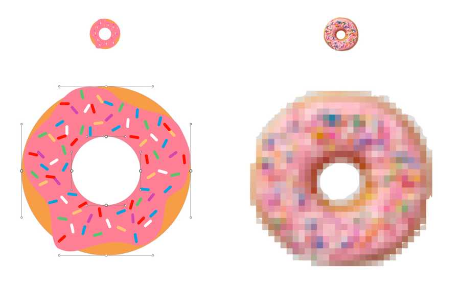
The first important choice in image optimisation is the format of your image. That starts with deciding whether the image is vector or raster. Vector images are made up of points, lines and polygons to create an image that, through the power of maths, is resolution independent. Raster images consist of individual pixels, they are not resolution independent but are perfect when photorealism is required.

There are four image formats to consider:
- SVG
- PNG
- JPG
- WEBP
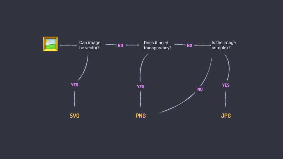
Choosing the right format is important because each format has strengths and weaknesses. To help in choosing the right format I came up with this workflow:

I’ll explain the workflow in a little more detail.
-
Can the image be vector?
Often this applies to logos, icons and illustrations. Times when the image isn’t photorealistic and you want resolution independence. If that’s the case, SVG is the best option.
-
Does the image have transparency?
If the image isn’t able to be a vector but needs transparency, for example a transparent background, then PNG is the best option.
-
Is the image complex?
If the image is complex, meaning there’s lots of blending colours (gradients), like a photograph, then JPG will be the best choice.
- If the image isn’t complex, then PNG is likely the best choice.
This is a basic workflow to put you on the right track. You’ll start to know which image format works when you look at images but if you aren’t certain, there’s no harm trying each format and comparing the results.
You may notice the lock of WEBP in the workflow. I typically leave WEBP until there’s automation — which we cover later. It is a good option though, it supports transparency and offers great quality with low image sizes.
WEBP was primarily a Chrome format but recent browsers releases have improved support with Edge 18 and Firefox 65 adding support for WEBP. Other vendor’s are said to be experimenting with the format so it’s worth keeping on eye on caniuse to track WEBP support.
Size
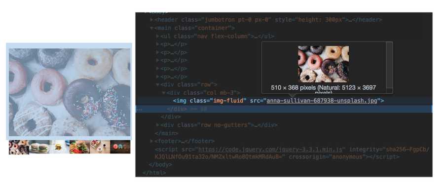
With the images in the right format, the next step is selecting the best (smallest) possible image size. One approach to this is to use the developer tools to inspect the site.

Developer tools tell us two interesting things, the size the browser is using and the size being sent. The best result is have those as close as possible. You’ll need to take inventory of the images and the various breakpoints of the site to determine the optimum number of images for your use case. This could mean images for mobile, tablet, desktop or mobile and desktop or several in between. You’ll need to decide based on your design and strike a balance between maintainability and performance.
Once you know the image sizes, there are a few ways to resize images. Here are a few options that I have had success with in the past:
-
Sips
Sips is a command line tool that can take various options and wildcards to quickly modify images
For example this will resize all jpgs in the directory to have one side a maximum of 510px
sips -Z 510 *.jpg
Type man sips in terminal for usage instructions
-
[ImageMagick](https://www.imagemagick.org/)
ImageMagick can resize images (and much more). It’s a valuable tool but does come with a learning curve. The documentation is very helpful though.
-
Photoshop
The batch processing tools in Photoshop are great for tasks like this.
We now have several images meant to be displayed in the same place. This is where we reach for the Picture element. The Picture element combined with srcsets does a great job not only showing the correct image for the size but not downloading the other images, saving valuable bandwidth.
Browser support for the Picture element is great. Even for browsers without support, they default to displaying the img tag within, which will be fine in most cases.
<picture>
	<source media="(min-width: 60em)" type="image/webp" srcset="donut-large.webp" />
	<source media="(min-width: 60em)" srcset="donut-large.jpg" />
	<img src=“donut-mobile.jpg” />
</picture>
Notice in that example that Picture gives us the ability to include different formats through the type attribute, opening up the possibilities of using WEBP within the project.
Compression
The third part of our image optimisation process is compression. Compression will make educated guess about surrounding pixels and remove unnecessary metadata from images such as location and device information. There’s plenty more to compression, it’s a complex area, but there are great resources that explain compression such as Una Kravets Mixin Conf Talk.
ImageOptim
For simplicity ImageOptim is the tool you should use for compression. It’s a simple drag-and-drop utility, that provides great results, using industry best compression algorithms.

Squoosh
Recently a team at Google released Squoosh.app. Squoosh is an online tool that enables you to upload an image and test different approaches to image compression right in your browser. It can be interesting to see how different algorithms and image types react to compression.
Guetzli
When quality matters and you aren’t worried as much about time, Guetzli is a great optimisation tool. Another tool from Google, Guetzli gives results similar to that of WEBP. It can take a long time to optimise an image, so keep that in mind when considering Guetzli.
guetzli --quality 85 source/donut.jpg build/images/donut.jpgSVGOMG
The last tool is SVGOMG. Another tool from Googlers, SVGOMG allows you to upload a SVG and trial different options of compression to see the results and download the compressed image.
That’s a list of tools available to compress images. There are many more. The main takeaway should be that you should compress. At the very least, put your images into ImageOptim and let it do its thing.
To close out image compression, here are a few more tips:
- Start with the original quality image. This way you won’t have artefacts from other compression.
- Reduce the colours. If you can, reduce the number of colours in your image for even better results
- A good range for quality is 75–85%. That’s a guideline though, play around with different qualities to see what works. Some images aren’t as significant as others so could have higher levels of compression.
Automation
As much as you can you should automate this process. Automation can be very dependant on the project you’re working on and its setup, but there are a few things to consider.
WEBP
Earlier I mentioned WEBP is best used in automation. Browsers will send Accept Headers when requesting resources from a server. The header can look similar to this:
Accept: text/html,application/xhtml+xml,application/xml;q=0.9,image/webp,image/apng,*/*;q=0.8The browser signals to the server that it can accept image/webp. Your server then, instead of returning the original image can return a previously converted WEBP to the user. More detail on this approach can be read about in Google’s Web Fundamentals article on Image Optimisation.
To convert images to WEBP very much depend on your build chain and that’s a lot to cover for this article, so that same Google Web Fundamentals article provides great information on both manual and automated processes for converting images to WEBP.
Automating Size/Compression
Resizing images with the tools mentioned previously is a great start but you may have multiple image sources or multiple contributors providing images. This is where smart cropping can come in handy. The easiest way to get started with smart cropping is through services such as Fastly or Cloudinary. Both have vast features, including ratio cropping, smart cropping, image optimisation and more for relatively affordable pricing. It’s worth diving into their documentation to see what’s possible.
As mentioned there are costs associated with cloud services, so you might want to explore open source alternatives such Imageflow or thumbor. You’re trading convenience for control, again that will depend on your project’s requirements.
Don’t use images
This tip might sound strange but don’t use images — if you don’t have to. There’s so much power in HTML and CSS. The more you learn and understand these tools, the less you might need to use images, and the most performant image is to not have one.
Take a look at examples such as Pure CSS Francine made by Diana Smith. Now, this might not be super practical for everyday image and takes considerable skill to achieve, but it’s an amazing example of what is possible with CSS alone.
A more practical option, is the following text effects codepen collection created by Mandy Michael. Not only are they created (mostly) without images but remain editable, within the browser.
Hopefully those examples will convince you of the power of HTML and CSS and give you amazing ideas for what you could create!
That wraps up this introduction to image optimisation, while it certainly isn’t exhaustive. It will give you a great foundation to start using images in the best possible way. If you are interested in further reading, take a look at Addy Osmani’s Essential Images Guide and Automating Image Compression guide on Google Web Fundamentals. If you have questions or comments reach out to me on Twitter.